
When last we left my little organza experiment, I had tried some shadow work á la Gary Clarke and found that my work was not what I was looking for.
In this piece, I'm playing with the the concept of receding color out-of-doors. In the past few weeks, I've had two teachers come into my life to give me advice on this issue. One was my friend and mentor Canby Robertsen...the other was Anna, a reader of this blog who recommended I check out John Carlson's Guide to Landscape Painting .
.
Well I don't know about you but when two people tell you the same thing in a short period of time, I listen. So I went off and found Mr. Carlson's book in my library and have been attempting to apply his principles to my little experiment.
Basically, he says that yellow fades out of a landscape as it recedes from the foreground. This means not just the yellow itself but the yellow contained in all mixtures...so warm reds, oranges blues etc. As the yellow fades, the blues increase in intensity.
Given a great stretch of country to study this phenomenon, it will be seen that even the violets (purples) eventually give way to the blue. We may have a range of hills, one behind the other; the nearest one may be a warm violet (or contain red, blue and a slight amount of yellow in its color composition); the next hill behind it will be a trifle bluer violet; the next behind it still bluer, and the farthest one almost pure blue (tempered with the prevailing sky color).
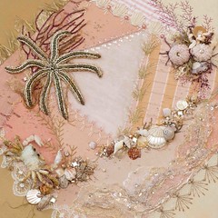
 |
| Photo credit Derek Bruff |
He adds that also all things become lighter in value as they recede from the eye and THE law states:
All things become cooler in color and lighter in value as they recede into the distance.
All you painters and artists out there probably learned that in Art School 101 but for me it was all new, so thank you Canby and Anna.
Though my subject wasn't hills but stones, I thought I would play around with these ideas of receding color while at the same time playing with the organza to accomplish feelings of depth.
I've had some mixed results.
The first thing I did was print out another picture onto organza to use for layering.

You'll notice that the color is more yellow and deeper on my second printout (top of photo) than the original. I didn't want that but I only had one more piece of printable organza so I had to make do.
First I basted the second photo on top of the organza and worked on the stones that were in the foreground. The big one on the right, the middle and the left...

After working the left one, I wanted the front stones to be darker so I tried sandwiching a bit of black netting between the organza layers and I liked this effect.

I'd already stitched the center stone so I had to push the netting between the two layers and it had a tendency to bunch up and not lie flat. I'm still trying to decide whether I like the bunched-up look better than the uniform layering on the other. I think if I paint the shape a little, the bunched effect might blend in nicely. We'll see.

After working the top layer, I appliqued three more stones on the backside of the fabric. I liked this look because it did give the appearance of those stones being behind those front three. I added the netting to the one on the left just to see what the effect would be. I'm not sure it shows in the photograph but it does sit further behind the two other netted stones...

Lastly, I introduced the cooler and lighter tones to the stones that are furthest away by using the shadow work technique. This time I liked the hue that the cooler color cast onto the stones.
 |
| Back side of work |
I'm not sure I've got this completely right but it's been a good exercise.
Next I intend to stitch some of the flowers and grasses in the foreground on top of the organza. According to the rule I should make sure I have some yellow tones in my greens and in my purple, right? So that blue green in the picture below probably isn't the right choice...

Back to the drawing board for me. See you next time.


13 comments:
I like where this one is going. A lot of painters make many versions of the same view - Monet springs to mind - so maybe you can view it that way.
Fabulous that you were given such help ~ yet another journey of discovery that I am enjoying....looking forward to seeing more!
Susan ~ looks like you're having fun and putting Carlson's wisdom to good use! Glad that you were able to find a copy of the book.
I look forward to seeing how you work through the foreground elements. Stitch on :)
I know nothing of art and colors and receding or foregrounds however I know you study and practice and work very diligently on your stitching. That makes your work so amazing dear. Happy Thanksgiving...
Susan this is working so well, can`t wait to see it with the stitching on
You might also want to include some very fine strokes of a really bright red in the foreground - that will help to pull out the yellow in the foreground and push the blues further back.
The black netting worked really well - it somehow helps to create a stony feel!
Susan you have got the technique working much better this time, the colours blend more gently with one another
You amaze me. I love watching this piece grow.
I love this Susan! I really didn't understand at first what you were striving for - I read the words but couldn't 'see' what you meant. Now I get it, and it's wonderful - you have added to the mystic quality of the stones but also seemed to have made them more approachable...
There's much more depth in this now. Way to go!
What Gracie said. :-) Just wondering about the black net...do you have any that is slightly finer (more like tulle)? Just wondering what a difference that might make. It might be more subtle; on the other hand, that might also mean that it gives the stones less texture...Just some thoughts!
I like the raffia and the scrim (?) on the left. They seem to speak to me more than the threads do. There is nothing soft about the stones or the grasses and flowers.
It's fun to "watch" you think, Susan. Hope it works out this time to your satisfaction. Happy Thanksgiving, too!
Post a Comment