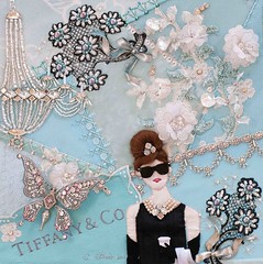
Audrey has finally gotten her cup of coffee.

And let me just say that I definitely need a smaller set of fingers for doing that teeny tiny work. I made that little bugger from a snip of cardstock and the final cup is only about 8mm tall.
But I'm glad Audrey got her coffee. And now I'm finding myself in need of a coffee break myself...to step back and make the final design decisions for the block.
When I received Mr. Miller's pin, I went through all kinds of ideas of how to use it in this piece...as the centerpiece of a "necklace" or "bracelet" seam treatment, in Audrey's hair, in the flowers...and none of them quite fit.
Then I stumbled upon this Tiffany butterfly brooch that showed at the Pan-American Exposition in Buffalo in 1901...I thought to use the pin as the thorax of the butterfly...and, well, I loved that idea.

And so I set about to create a rendering of the Tiffany butterfly brooch. I traced it onto tracing paper then scanned it into Photoshop. Once in Photoshop, I could clean up my tracing, copy the wings, and make mirror images of the wings to create a final paper butterfly pattern...
I then shrank the pattern to different sizes to see which one worked best in the block composition and with Mr. Miller's pin...

I liked the larger one because it scaled nicely with the stick pin plus I have more beading options for a larger one. To get detail on a smaller butterfly, I would need sizes of beads that they just don't make anymore. I'm already planning to use size 20 and I can't get any smaller than that.
So...to go smaller means to lose detail...and I'm not sure I want to do that. Yet, in my heart of hearts, I feel the butterfly is a tad too big...and perhaps I should shrink it down just a bit more.
On the original brooch, Tiffany used pink tourmaline in addition to diamonds. I like the idea of introducing a hint of pink into the design plus I like the idea of staying true to the original design.
In order to figure out if using a bit of pink in the butterfly might affect the overall design, I copied the pattern onto cardstock, cut it out and ran it through a Xyron machine.

For those who don't know, a Xyron machine turns anything into a sticker. Then I could use the sticky side to audition different crystals and beads...

I definitely think a hint of pink works.
Beading my "sticker" alao allowed me to get a sense of the weight of the wings once beaded. My intention is to make a beaded stumpwork butterfly and, since I've never done that before, I don't want the butterfly to wilt under the weight of the beading.
And so here I sit, debating different options and drinking a cup of tea (I like tea better than coffee).

- Is the butterfly too large? I like the difference in scale that the larger butterfly introduces...bringing it down a bit gets too close to the scale of Audrey's head and the other elements on the block...I still think it's a tad large...If I give a bend to the wings once attached, this will make the overall effect of the butterfly seem smaller...hmmm....
- OK. If it's a tad large, then bringing it down in size a bit will make it a bit harder to bead and to get detail. That being said, nobody will probably know that but me...well, and all of you who choose to read this drivel...Making it a bit smaller will also reduce its weight which is a good thing.
- If I were to go smaller, I could increase the size of the "motif" by adding one additional small, lace flower over the intersection of the seams to the left of Audrey's head...that might be nice. It would serve to introduce those lacy flowers into the left side of the block and would keep the butterfly company so he's not hanging out alone...But would that make the block too busy?
[Note: Don't consider the orientation of the butterfly. Its position is subject to change. The wind was blowing and I didn't have a pin!]
Well. It's a lot to think about. I think I'll have another cup of tea and do something else for a while. I'll come back to it later and maybe by then you all will have weighed in with an opinion.
Happy weekend to all of you. I'm sure something will happen by Monday...






33 comments:
I am always in awe of your creativiity!
I'm thinking the butterfly should be a tad smaller, but I'm so uneducated on eye movement and such in crazy quilt. I am totally sure that many of your cohorts will step up with suggestions.
You certainly have a lot to think about every step of the way. Thanks for sharing your ideas as you decide which way to go. Its very educational.
The coffee cup is perfect..love it. As to the size of the butterfly it's hard to say. It seems a good size to me and I think the addition of the pink will be lovely.
Add the flowers on the other side of Audrey's head and then try the butterfly next to/on the flower and see how that looks.
I hate being Anonymous -- but Google won't let me do it any other way!
http://maddiecanfly.blogspot.com
It's wonderful Susan. Will you please put an "actual size" photo on your blog when you're finished?
I think the size of the butterfly is fine a little larger or smaller..and the pink is delightful... It is with the orientation that I have a suggestion... I stuck it in photoshop and just sent you my thought...Remember you asked!!! Hugs Ger
as the butterfly is larger than life anyway, stay with the larger one and add a part of a flower...butterflies cover up part of a flower when they settle on one anyway, so why can't yours do they same?
I think the butterfly is OK size-wise. I like the butterfly on its own (it's nice to have a quiet spot of blue to balance out the crazy-ness of the rest of the block). I agree with Gerry about changing the orientation of the butterfly. I would turn it so it's flying more NE than East, and maybe move it a little left or down.
Hi - I do a lot of embroidery that I design myself so I'm familiar with your dilemma. My thoughts (and take them for what they're worth, which is very little) are that your problem with the butterfly is not size. The size is correct, for all the reasons you said. The problem is balance. In the rest of your block your elements are visually balanced through repetition, spacing, etc. Does this make sense? The butterfly will look odd beaded and floating alone on that side no matter the size because it would be the only beaded element standing alone (and thus it would distract from Audrey, your centerpiece). My suggestion would be to make your butterfly as planned, then integrate her into the piece the way you have flowers clustered together or a very large chandelier, etc. You could applique some lace onto the block, and make some tiny butterflies (plain chiffon done like the petals were in maybe a very pale pink would be totally sweet) or flowers or just beaded textured whatever to integrate her into her area.
Coffee cup really adds to her. I think the butterfly will be a lovely addition. Is't size kinda goes with the flower beside her head. Love the touch of pink.
Whatever you do should please you and only you.
Teresa's Heartfelt Stitches
PS - I know you want to use the new piece of jewerly but if it doesn't fit and your heart is not happy you may have to leave it out. I am sure she would understand
I love, love, love the piece so far. I'm thinking that the butterfly should be smaller. If my monitor is showing the block correctly, the butterfly takes up the same amount of space from the top of its wing to the bottom as the distance from the top of Audrey's hair to the bottom of her chin. Do you want that proportion?
Gita/Bubbygigi
coooo cute coffee cup ... mmm butter fly seems to be the right size and that pink adds a certain something but it does need a flower or something to be near it to balance the space out a bit does that make sense ???? still love reading your drivel ... you sound just like me when trying stuff out ..lol :) love mouse xxxx
I think that the butterfly should be a little smaller. The other motifs (eg chandelier) close by are quite large, but it makes Tiffany look a bit small. Especially once it's all beaded, it'll serve as a focal point and you want Tiffany to be the focal point.
I don't think you need an extra flower - I think it works well as is. Maybe a decision to make once the butterfly is in?
The cup of coffee is just *perfect*. Wow and double wow - good work! And the gloves! She is looking *absolutely beautiful*
Did you end up using a bit'o'wax in her hair??
This is a masterpiece of yours. You ARE keeping it, aren't you?
Anonymous said what I was trying to say, only better, re focal point. (I wrote before reading the rest of the comments - didn't want to be influenced when I write comments).
And yes - that point about the butterfly being the same size as Audrey's head, as bubblygigi mentioned.
Audrey/Tiffany. You know what I mean!
Yeah, me again. Just went back for another look.
What if the butterfly is a bit smaller, and moved down (off the line of the lace) so it's head points at Audrey's face - the same as one of the flowers on the other side?
Also, I've just skipped back some posts. I'd love to hear about adding the gloves (gosh - fiddly too!) and especially how you did her hand, holding the coffee mug.
From your last post and in this one, you did mention using Mr. Miller's stick pin as the thorax, so to me the butterfly's size would have to go according to the pin's size. Just MHO.
I love that coffee cup. You are so talented and do such intricate, lovely work.
FlowerLady
Audrey's coffee cup is so cute. I love the idea of your butterfly and introducing a touch of pink in the rhinestones for Mr. Miller's stick pin. Your auditioning detail technique is the best way to "see" how all will look when stitched. Happy pondering while September surrenders to October...
This is BEAUTIFUL!!! I love the coffee cup! All of this made me want to watch the movie so I borrowed it from my sister..
I love watching this piece come together. It is a journey and sometimes you need a cup of tea and a pause to know what to do next. I am sure it will come to you.
I love butterflies. They have such powerful symbolism.
Good luck!
I love the idea of the butterfly and a touch of pink. Looking forward to seeing more.
You always amaze me with your creativity! It's so fun read about your design process! Love the pink in the butterfly!
I have to agree with Flowerlady. If you still want to use the pin as the thorax, the rest of the butterfly has to be in proportion. The pink idea adds another focus to the piece. Go with your gut instinct,if your past work is anything to go by it usually works. Look forward to the next installment of the story.
Kim
Oddly enough, I think the butterfly is a tad too small. You might want to enlarge it slightly to check if that would balance the final composition a bit.
Audrey is just stunning! I cannot imagine trying to stitch something as tiny as the fingers on her gloves!
Good luck with the butterfly and Mr Miller's pin. Thank you for sharing your thought processes.
*Trust yourself.* You've got a lovely eye for design and everyone has some great suggestions for you if you're looking for other ways to tweak it, but you're right to step away to look at it. Sometimes we get too close to our work. And I agree with Teresa's (heartfelt stitches) comment, if the pin doesn't end up working just right, save it for another block. It's great as a butterfly! But don't alter your vision of the block to make it work. You'll know when it's the right time/place to use it. I really like your touches of pink. It really warmed up all that silver and blue. Pretty, Susan. Audrey is looking very glam. :)
It is so exciting to follow this piece and your thoughts.
I think I should add a piece of lace first. Then you can decide about the butterfly.
Lots of suggestions! Whatever you decide will be wonderful. Your work is always gorgeous. Jane in MO
You've had so many suggestions, I don't think I will add to them - except to say I think you need to prop it up and look at it for a while. The right choice will come to mind!
Your work is beautiful but the design is getting a little off balance. I think that you should turn the butterfly counter clockwise a few degrees and maybe even lower it a bit so it seems to be taking off from having landed on the Tiffany logo. It could even be a little bigger.
Wow! Such a tiny little cup! You have done such an amazing job on this block....I cannot wait to see the finished butterfly!
I think you ought to let the powers that be at Tiffany know what you are up to....
I think the size of the butterfly fits the scale of the flower bouquet perfectly. If there's a way to associate those two motifs, I thin you're good. I love the pink touches. This piece is amazing.
Love the coffee cup, a perfect detail!
The touch of pink beading warms up the block so beautifully. As to the size, I agree with other comments that the size isn't the problem, it's the balance.
I also agree to trust your instincts, as evidenced by your other spectacular work. Don't compromise your vision for this block. The butterfly/pin idea can always be the focus of another block :)
Post a Comment